Generic to Warm
Pivoted from sterile athletic facility to an inclusive, vibrant family brand.
I reworked San Francisco Fencing Academy from an undefined, sterile identity into a warm, inclusive brand for kids and parents, then turned that brand into a working campaign asset generator app for summer camp marketing.
SFFA had world-class coaching depth, but the public identity looked like a standard athletic facility. It did not communicate warmth, inclusion, neurodivergent-friendly coaching, or the infectious energy families look for in youth sports.
I engineered a complete visual identity system around "Fencing for All": bold typography, warm cream, crimson, gold, electric blue, and dynamic tie-dye motion. To prevent design drift across marketing channels, I operationalized the identity into a custom React generator application, allowing staff to produce consistent summer camp promotional assets without starting from scratch.
Creative identity becomes an operating tool when design systems are codified into software.
Pivoted from sterile athletic facility to an inclusive, vibrant family brand.
Inclusive youth fencing and neurodivergent-welcoming instruction became visible.
Campaign materials became automated and repeatable rather than one-off design tasks.
Built purpose-driven enrollment funnels and collateral for parent conversion.
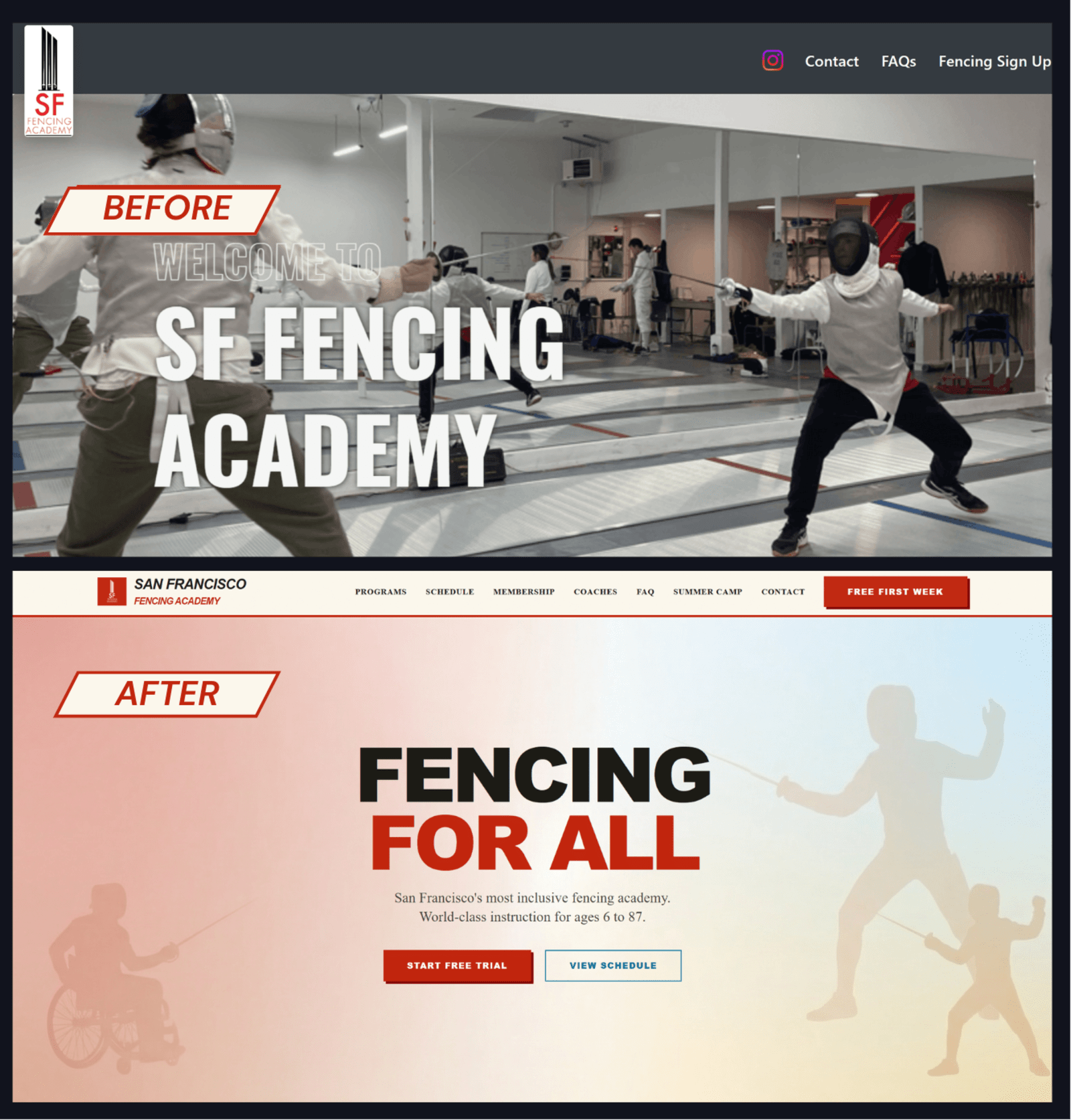
The redesigned hero replaces a generic fencing-club look with an inclusive brand signal: "Fencing for All," warm color harmony, accessible imagery, and clearer parent-facing conversion pathways.
The brand book establishes the systemic rules: voice, typography, color harmony, program positioning, and reusable visual direction for all public collateral.
The brand codified into custom React tooling: an automated asset generator that produces on-brand summer camp promotional materials without manual design friction.
Identified the disconnect between high-touch coaching values and the sterile, generic public-facing web experience.
Anchored the brand around accessible, parent-friendly youth fencing, community warmth, and neurodivergent-friendly instruction.
Engineered palette, typography, tone of voice, background textures, photography direction, and component rules.
Translated brand guidelines into a custom web generator application to automate marketing collateral production.
Deployed the automated system to drive summer camp enrollment across parent-facing digital channels.
In youth sports and educational programs, customer trust is earned at the intersection of emotional resonance and operational consistency. Parents make enrollment decisions based on feeling that a community is safe, welcoming, and structured for their children. If the public presentation feels clinical, cold, or disorganized, credibility dissolves before the trial class is booked.
At San Francisco Fencing Academy, developing the sunshine tie-dye identity and backing it with an automated asset generator demonstrated how design systems solve operational problems. By mechanizing brand production, coaches and staff never have to improvise marketing collateral. High standards remain effortless, and the academy's welcoming ethos shines through every touchpoint.








I bring an Olympic athletic background to fuel the relentless discipline required to execute, a deep research background focused on hyper-targeted strategy, and the grit of the immigrant experience. I rely on hard analytics and behavioral strategy to build resilient operational systems that help businesses actually run.